Mindfulness and Mobile-First
Bottom Line Up Front: Remember to maintain mindfulness and mobile-first when designing responsive web experiences, and to always QA your designs before going into production.
Backstory: My sister-in-law mentioned she was looking to start a career in UX and was looking into options for bootcamps. I suggested looking at Google's free course as a money-saving alternative, and in the course of our conversation I pulled up their page on my phone...

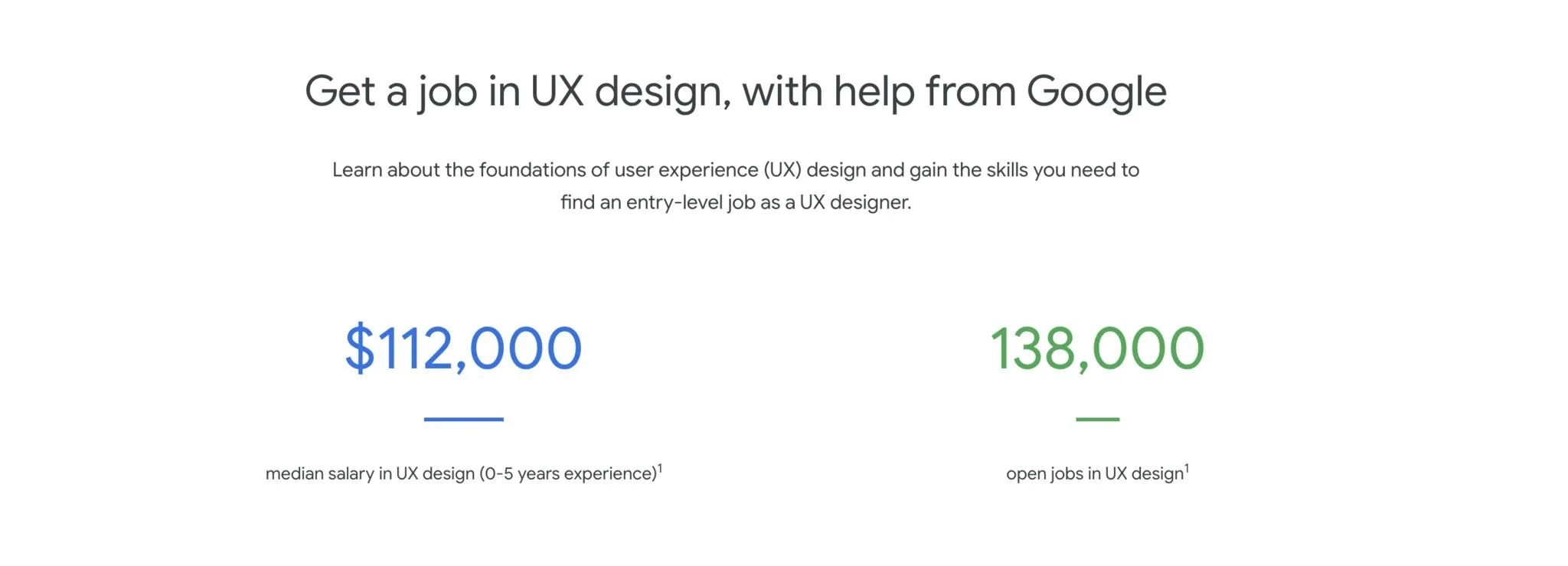
...and was immediately confused. The page seemed to inform me that the course was $98,000 (a number that has since gone up to $112,000, as seen in the first image below). After scrutinizing the page for a minute or two, I realized the mistake Google made.
As you can see in the second image below, that section of the page is made up of two content blocks which consist of a large, bold number, a divider, and a label. Someone at Google neglected to add enough margin to the bottom of these content blocks, so that when they stacked together in mobile view the label for the top block looked like it was explaining the large number for the bottom block. Then someone else at Google neglected to double-check the end-result before it went to production.
This is a small, relatively painless example of why it's important to lead with mobile. Make it look right in mobile, and it'll be easier to compose the layout when you get to desktop. It's not enough to just wave your hand and dismissively say, "Ehh, well everything stacks in mobile anyway, so it's fine." Spending a pinch of extra effort to double-check can save a user a few minutes of "brain pain" as they try to sort out your sloppy design.
At the very least, you should always remember to test the designs in mobile view to make sure that you have, as Radiohead says, "everything in its right place."