
Zero-Emissions Truck Website
Client: Range Truck Group
Role: Lead UX Designer & Site Architect
Responsibilities: UX design, UI/visual design, information architecture, site build
Collaborators: Tanner Quie, Olivia Luterbach, Taylor Ganser, Jodie Armstrong, Chloe Hjerpe
Overview
In early 2024 Bold Orange was hired by Range Truck Group, a dealer of zero-emissions trucks ranging from delivery vans to long-haul prime movers. RTG originated as an off-shoot of Twin Cities-based Ziegler Truck Group, which is a subsidiary of Ziegler CAT, one of the largest CAT dealerships in North America. While RTG would be inheriting a lot of infrastructure from Ziegler, it would very much be a standalone business. To remedy this, the team at Bold Orange provided branding, product strategy, and a responsive web experience.

Discovery
I joined the team early in the discovery process, and understood that I would be responsible for the design and build of the initial site. Because RTG was a new and unknown player in the Zero-Emissions field, we prioritized getting the client enough material to establish a presence quickly.
One of our creative directors and writers developed RTG’s new brand, blending futuristic elements with green hues inspired by the Pacific Northwest, and gave it a voice that was optimistic, forward-looking, and given to action.
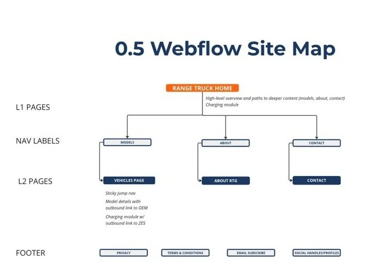
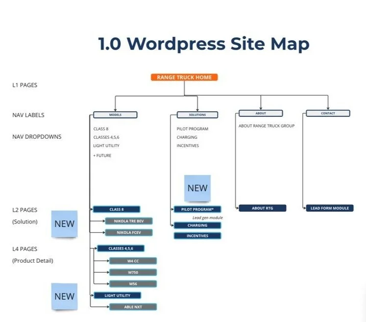
While they were developing this, I worked with the strategy team to establish our timeline. Because the client needed something to refer potential clients, investors, and partners to, we decided to lead with a simple, no-code website we could build and deploy quickly, then pivoting to build a more comprehensive WordPress site for later launch. We decided to use Webflow for the starter site.
Design
From the outset our goal was to build a scalable experience. I wanted to provide a seamless transition from the Webflow site to the long-term WordPress, and designed the components I would use to be as universal as possible.
I built wireframes for both mobile and desktop versions of the site, using general components from a wireframe component library I’d built earlier. Even though the website was simple, I still wanted to make sure that we were working from an approved structure to avoid any tedious and unnecessary rework. Included in the components was basic filler copy that also mentioned the topic and some basic directions, not only to help the client understand how we were going to approach storytelling, but also to inform the copywriter who would be joining the team for the design phase.
In addition to this, the team and I used my wireframes to identify components that would be reused throughout both the Webflow site and WordPress. I would use this list when building components for the design system.
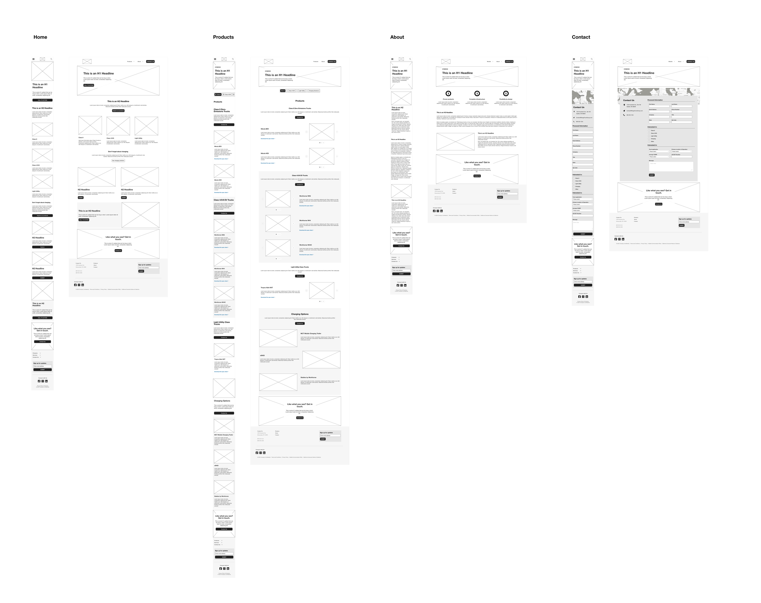
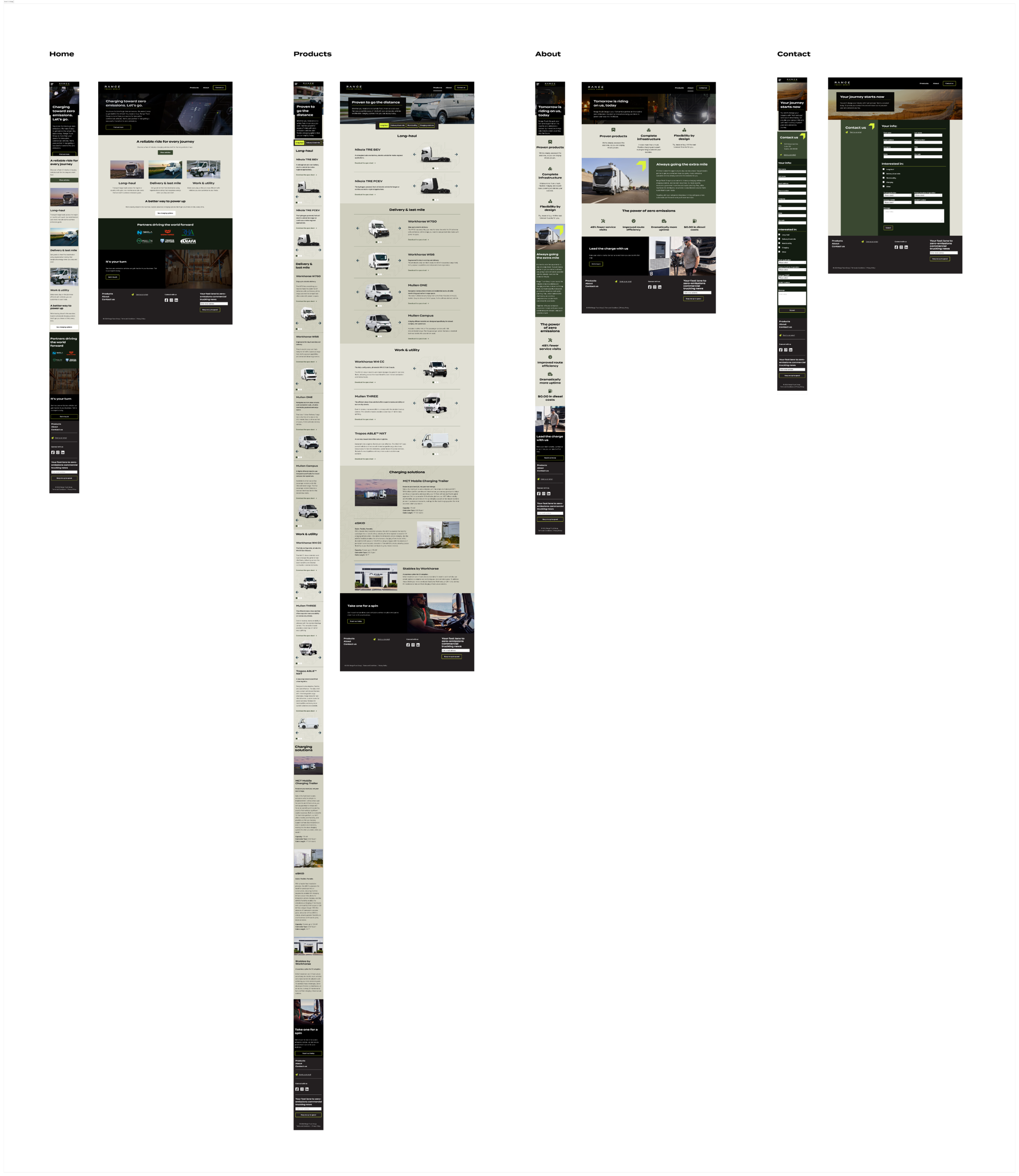
Once the wireframes were approved, I started designing the UI. By this time the branding had been fully approved, so the creative director and I took some time to look at the brand guidelines and wireframes and collaborated on an approach that would be dynamic and accessible, but also respect the branding.
I started building my design patterns by setting system colours and typography in Figma, and then building the basic components that we’d previously established during the wireframes phase. The extra time this took at the beginning of the phase allowed me to move very quickly later on, and also made minor pivots much easier.
The design was approved after one round of revisions, at which point I started the Webflow build.
Development
I was already moderately familiar with Webflow, though it had been some years since I’d used the platform. To enable us to move quickly, Tanner (Bold Orange’s Director of XD) and I decided to use the “Figma to Webflow” plugin. It turned out to be a frustrating experience, as even the simplest of components from my design rarely translated to Webflow accurately. It ended up being faster (and, it turned out, a better educational experience) to rebuild the page directly in Webflow and manually add visual elements from my original designs.
Once I dialed in a workflow, the build went fairly smoothly. My years of experience writing HTML and CSS came in handy as I made the adjustments needed for the components to fit properly. Tanner and I decided to divide and conquer on the pages, with each of us taking two pages, and then trading them to give the other designer an opportunity to find anything that was missed on the first pass.
The site was finished in six days.
Outcomes
Even though we finished the site build in a week, changes in the zero-emissions truck market and industry forced the client to make some strategy pivots that delayed the launch of the site for several months. RangeTruck.com was finally launched in late August of 2024.
While the experience was overall positive, in hindsight I now think it would have been more efficient to use Framer as our no-code dev tool. This is no insult to Webflow; it’s still a fantastic platform. But the mishaps resulting from the “Figma to Webflow” plugin caused unnecessary delays (which means we should have started researching plugins much earlier in the process). Because Framer is designed to interface easily with Figma, it would have simply been a matter of pasting pages from the latter into the former.
I also took away one key observation with regards to a small but meaningful disparity between the way UX designers operate and the way the workflows of no-code platforms like Webflow and Squarespace are designed:
“Mobile First” is a well-known axiom across the UX industry. These days I make it a point to design everything in mobile and add desktop screens afterwards. We lead with mobile first because that’s how the majority of users are going to access something we’ve created, and it requires the most attention in order to have a seamless experience.
However, no-code platforms force the designer to build the site in desktop view first, and then switch over to mobile view to make adjustments. With Webflow I noticed that sometimes changes I made to a mobile experience would be overwritten by changes made to the desktop experience of the same page.
My hope for the near future is that product leaders in charge of continuing the development of these no-code tools will adopt a workflow mindset similar to that of designers, since we will often be the ones using these types of tools to design and build experiences for our users.