Same-Day Delivery & Streamlined Checkout
Client: Schwan’s Home Delivery/Yelloh!
Role: Principal product designer
Responsibilities: Design leadership, research, UX/UI design, prototyping, user testing, design QA
Partners: Tanner Quie, Shawn Ricketts, Courtney Beyer, Hope Doom, Robert Boedigheimer, Paul Griebel
Overview
As the Lead Product Designer, I created and implemented a same-day delivery feature for Schwan's Home Delivery, later rebranded as "Yelloh!"
The Problem:
Schwan’s Home Delivery, an innovative, family-run retailer of frozen luxury foods since 1954, built its entire business model on the concept of regularly scheduled deliveries. The iconic yellow trucks (which served as the inspiration for their rebranded name) would travel down neighborhood streets across America, with the drivers going door-to-door offering frozen goods right off the truck.
But as technology advanced and online and mobile ordering took center stage, Schwan’s struggled to keep up. During the early Covid-19 pandemic, the rapid rise of competitors such as Instacart, Shipt, and others who offered same-day delivery cost Schwan’s millions of dollars in revenue. The company had roadmapped a version of a same-day delivery feature for their website and mobile app, but lacked the ability to produce it.
The Challenges:
The primary challenge was tech debt in the form of their front-end framework. In 2015 they had contracted with an outside agency to build a new website and e-commerce platform. Schwan’s had been interested in using Bootstrap because of its modular nature, but the agency recommended a custom framework of their own design. This custom framework, however, became neglected and by the time I joined the project it was obsolete.
This unfortunately meant that the framework was very inflexible when compared to modern platforms or CMS systems. When it came to designing the Same-Day feature, we weren’t able to implement an interface that flowed as naturally as some of the competitors we studied, like Target or Amazon.
The Solution
We released Same-Day Delivery in a phased approach.
Phase 1 was unveiled to customers in select locations, and allowed them to add items to an existing, scheduled delivery as late as the morning of (prior to this, a customer would be unable to add to an order after 4pm the day before a delivery). While not a “same-day” feature in the same sense as Instacart, it was a big step in the right direction.
Phase 2 was a broader, nationwide rollout in April of 2023, and included a more traditional (although still somewhat limited) same-day model. Users across the country could start a new order, select a delivery time for later in the day, and expect their items on time.
Phase 3, which ultimately ended up being shelved due to other operational and financial challenges, would have been a full-on same-day delivery feature competitive with those of major retailers.
Outcomes:
22%
Reduction in abandoned carts
18%
Conversion increase
$36
Average increase per order
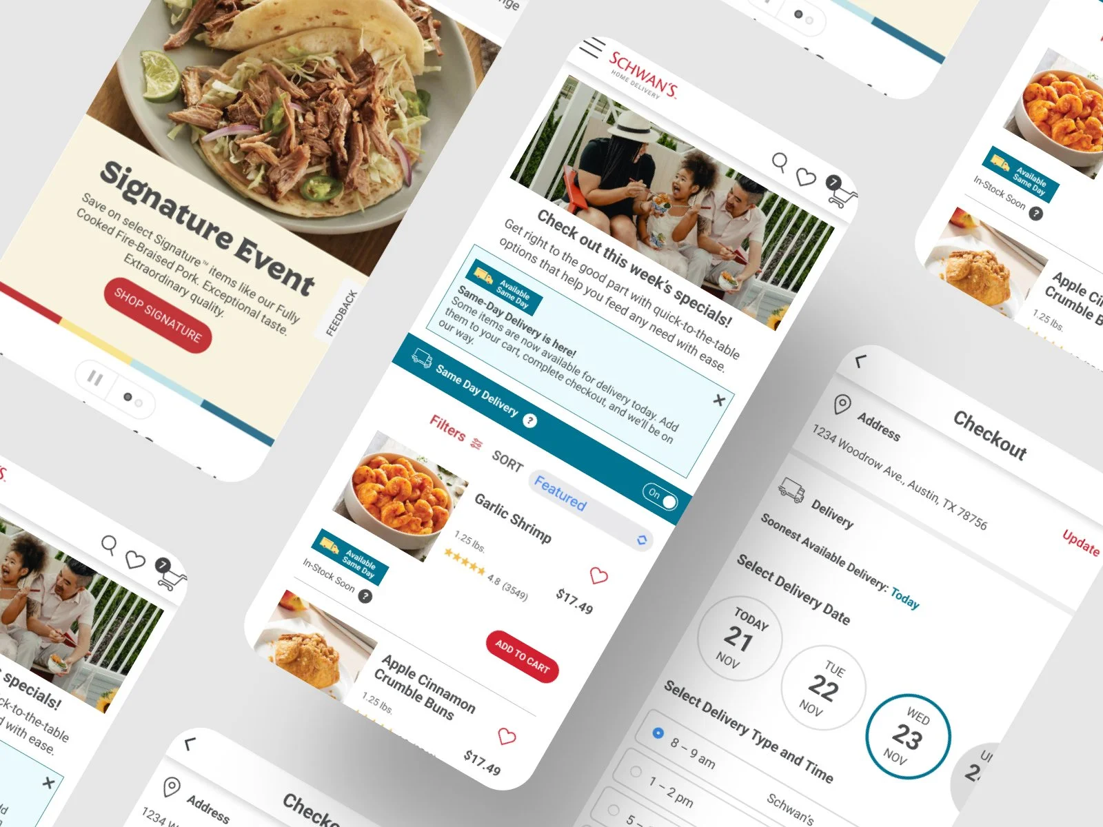
Same-Day Delivery
Discovery & Planning
Schwan’s had conducted user research prior to my joining the project team, and that helped inform the approach we took. I started by reviewing and studying their existing research to understand their users’ needs and desires. Research showed that most of the users were mobile users, so it was crucially important for me to make sure we led with a mobile-first mindset. We also learned that 53% of users were rurally located, and most were women between the ages of 35 and 65.
With a firm understanding of who we were designing for, my Bold Orange partner Tanner and I began mapping and sketching out the existing checkout flow and looking for the most natural and intuitive entry point for same-day functionality.
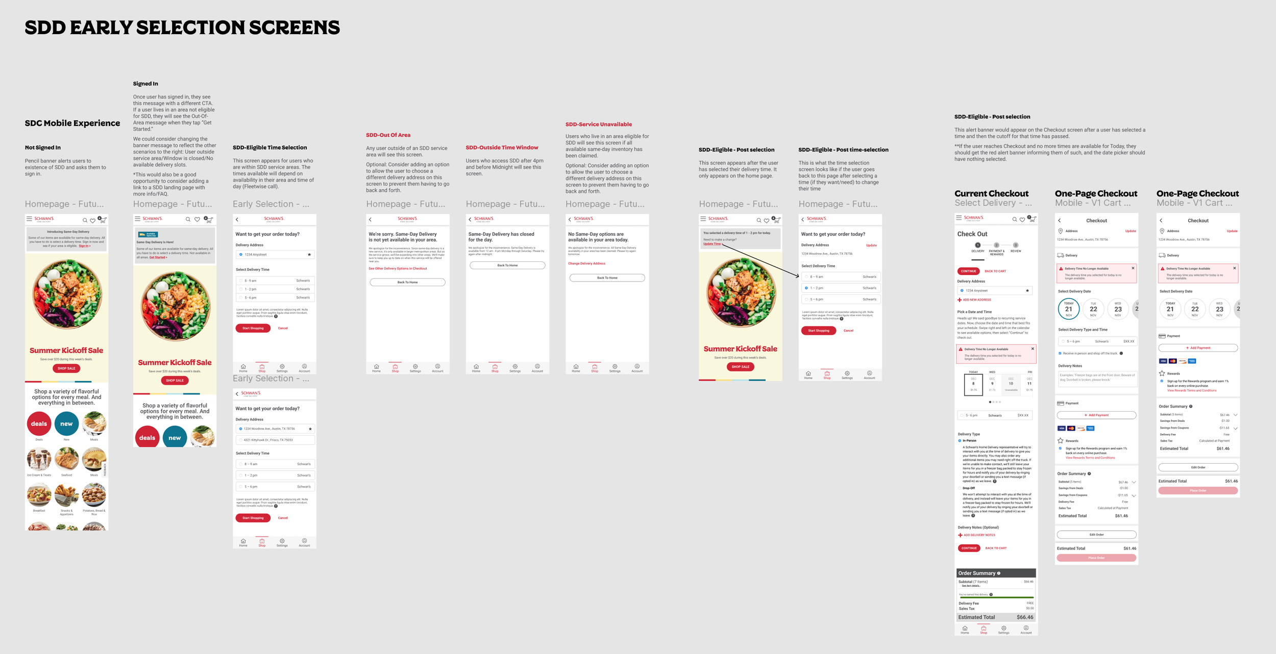
User Flows & Wireframes
After a several-month pause while the company sorted out other operational challenges unrelated to this project, I picked up where we’d left off and began working through the user’s path. I collaborated regularly with Shawn, our FED, as well as our engineers, product owner, and business analyst we examined the existing user flow. In order to see how the SDD feature needed to match up with other operational systems, I added in the different database calls and worked with the team to correctly identify when those would happen, similar to a service blueprint. We also brainstormed solutions as how best to reconcile the new flows and patterns with the company’s outdated and inflexible FED framework.
Once we agreed upon the flow, I started wireframing. During this part of the process I scheduled regular design reviews with the product owner and FED to catch any potential issues before they became solidified in the design.
UI & Visual Design
By this point I’d created a robust and scalable design system for the company, and I was able to rapidly assemble the UI for this experience. Since the SDD process largely existed alongside other pages, I was able to refer to the wireframes and service blueprints to efficiently and seamlessly blend the two experiences in one natural flow.
Prototyping
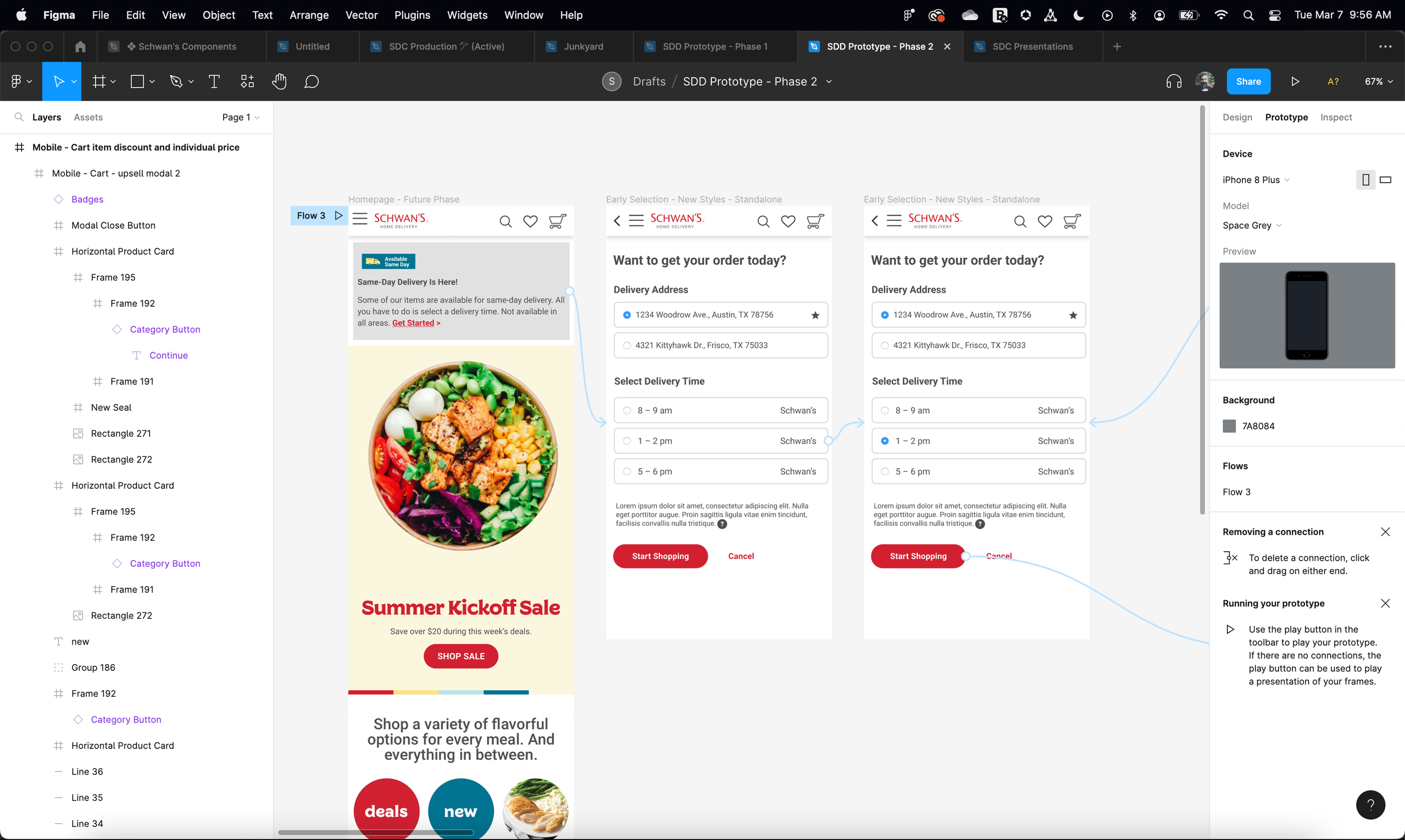
We did three rounds of rapid prototyping to test different approaches, which greatly helped us in validating certain assumptions and fine-tuning our approach. For the sake of agility we often used coworkers of mine from the agency (by this point I was the only Bold Orange employee on the entire account). I used Figma’s native prototyping functionality to not only build the test pages, but also to capture feedback from our subjects.
Streamlining Checkout
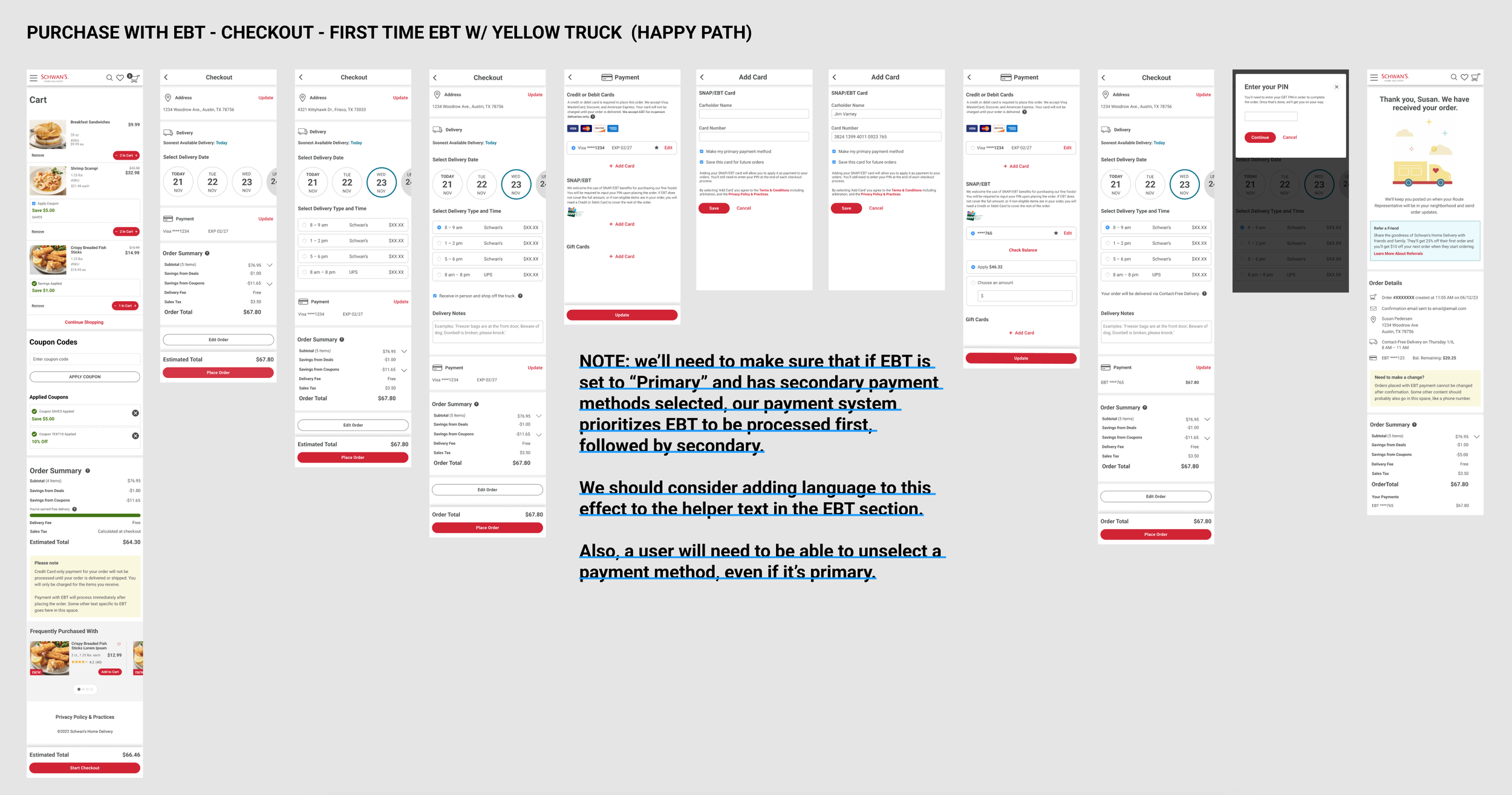
In addition to the same-day delivery feature, I led the redesign of the checkout process which increased efficiency, integrated EBT payment options, and added other small updates to enhance the user experience.
Discovery and initial design work had been done prior to my joining the team, but the updates had been put on hold for a number of reasons. At the time I picked it back up, I was the only product designer on the team. Thankfully I had thorough research from initial user testing to draw on.
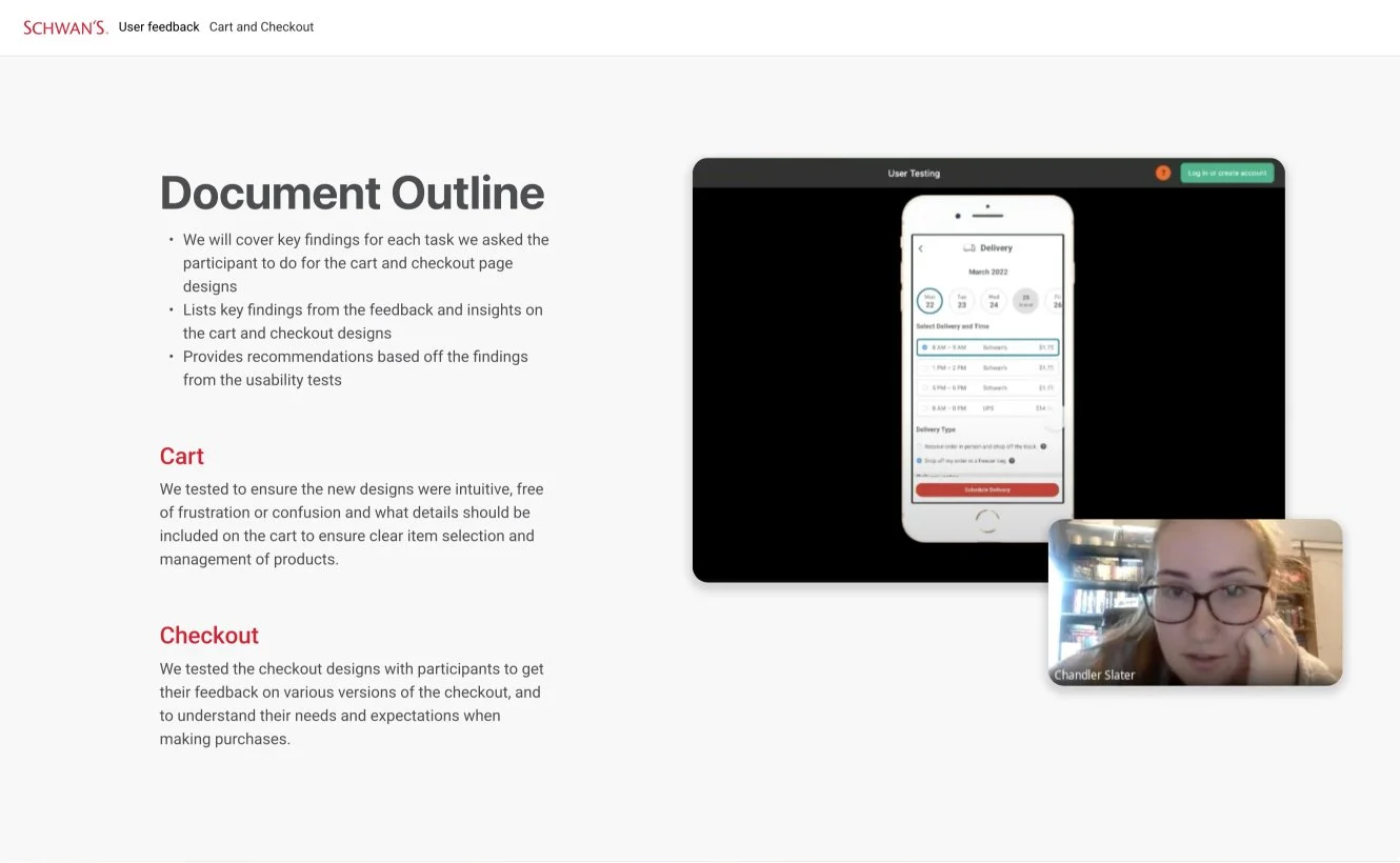
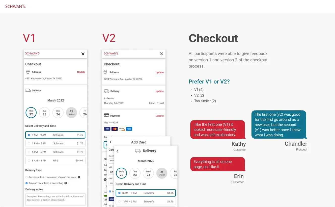
Users felt that spreading the experience over multiple steps was tedious and sometimes confusing. Competitive analysis showed that other e-commerce retailers frequently combined delivery, payment and rewards, and related screens in one continuous experience, and this had a big impact on overall conversions and engagement.
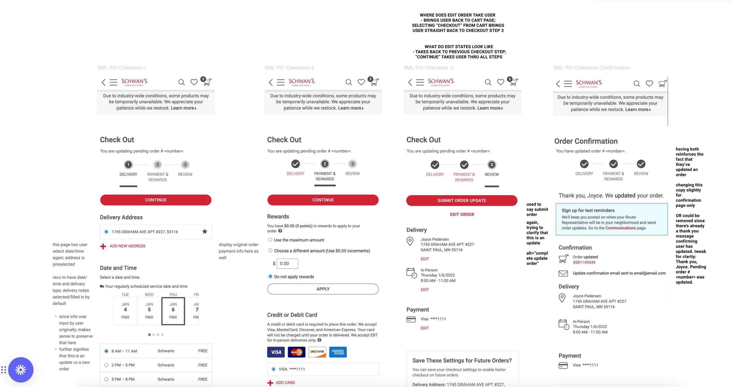
The below image shows the original multi-step process for checkout:
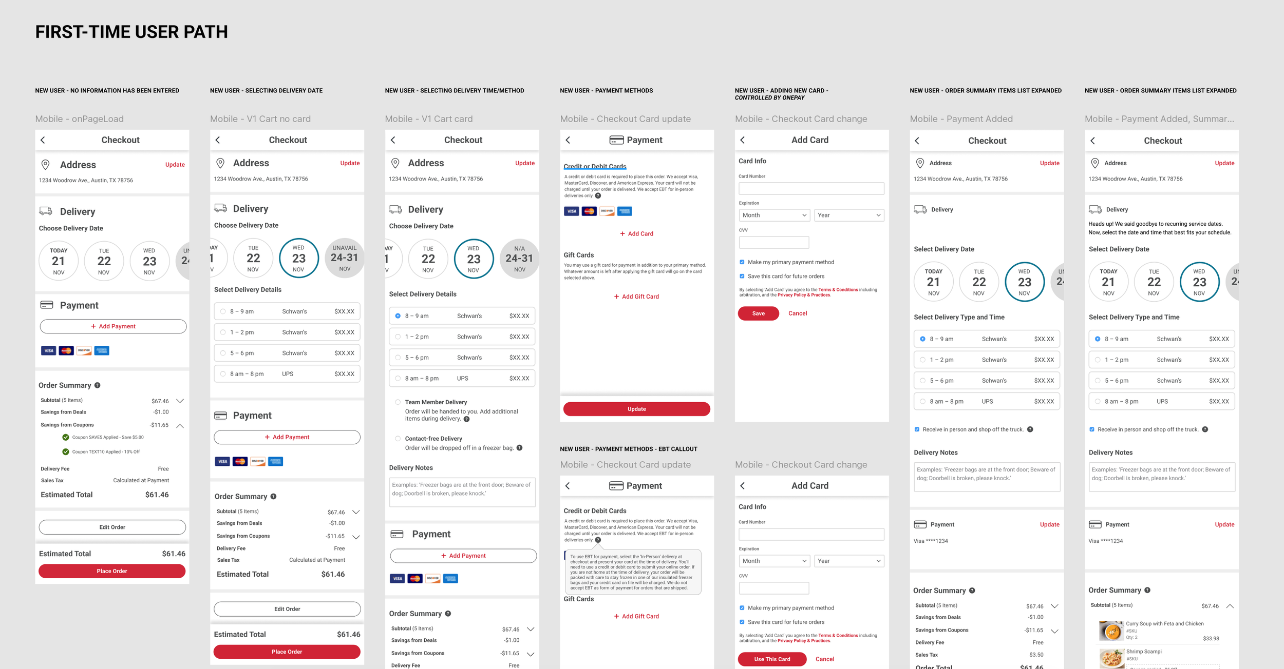
As an alternative, we combined the three screens into one continuous experience that incorporated panel menus to allow users to add or modify addresses and payment information, as seen below:
We then built a prototype and did some more user testing. The sessions were recorded and shared out with the rest of the team and primary stakeholders.
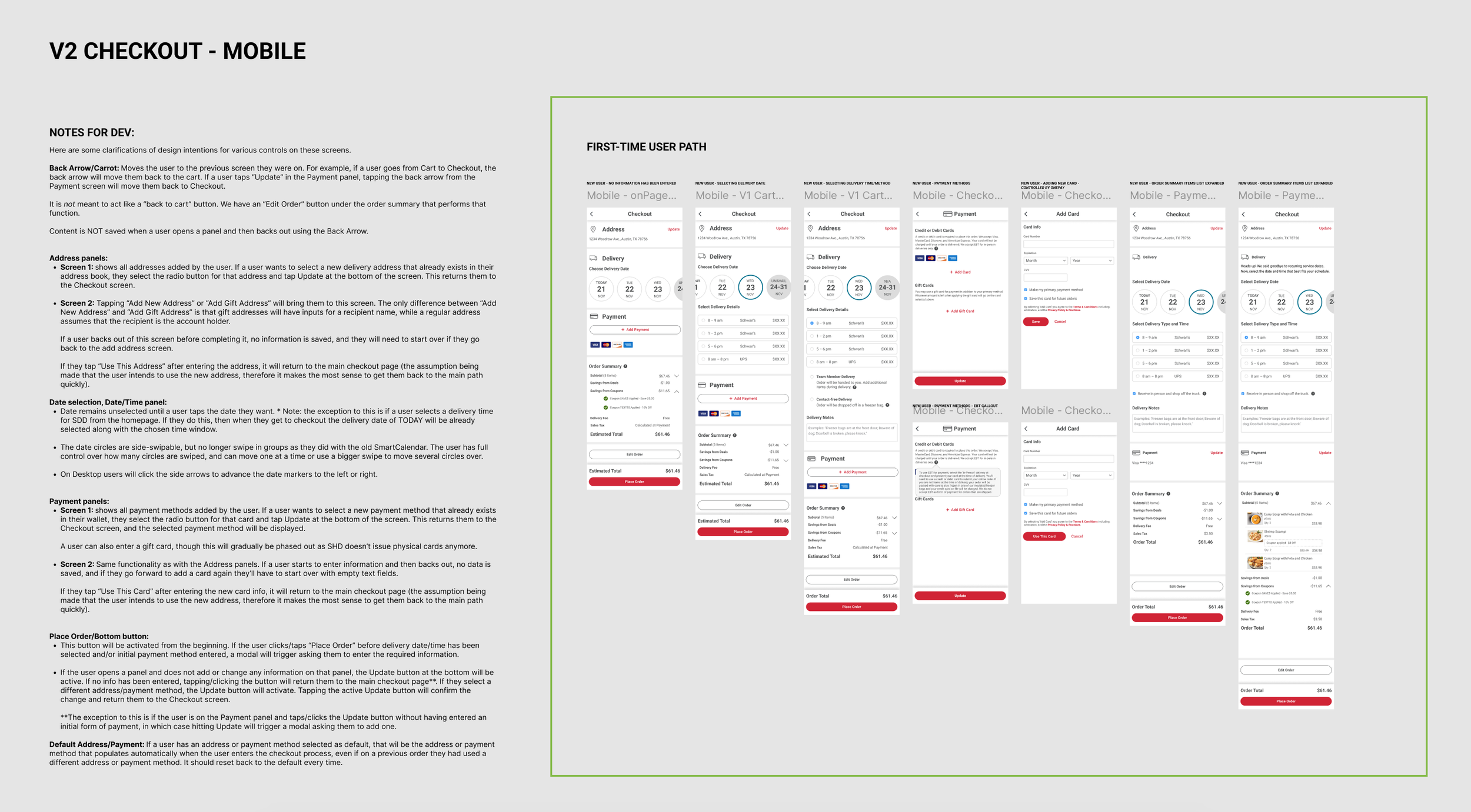
Once approval had been given, the team moved into the development sprint. I collaborated closely with our Front-End Developer to ensure a smooth handoff, complete with dev notes that he could reference as he built the final product.
Conclusion
In April 2023, the same-day delivery feature was successfully launched to the general public on both the website and mobile app, marking a significant milestone in the company’s long-term goals. Within the first month the company saw an overall increase in user engagement with the site, and marked a 22% reduction in abandoned carts during checkout. Conversions went up 18%, and orders averaged a bump of $36.